1st Financial Bank USA
1st Financial Bank USA asked for help to build a web and mobile application for use with credit-building student cards. Armed with a requirements list from the client, I worked with my design director to gather research, build information architecture, develop user flows and wireframes, and eventually a fully-responsive web and native application with over 160 screens. In 2020 I took over as principle designer for the project and work with engineers to provide designs and new iterations as the bank adds new features and updates to the app.
With the 1FBUSA mobile app and web app, users can check their card balance, check their monthly statements, make payments, communicate with the bank, and use the tools provided in the app to stay on top of their spending and build their credit.
Services Provided
UI & UX
Prototyping
Animation
Implementation
Years
2019-Present


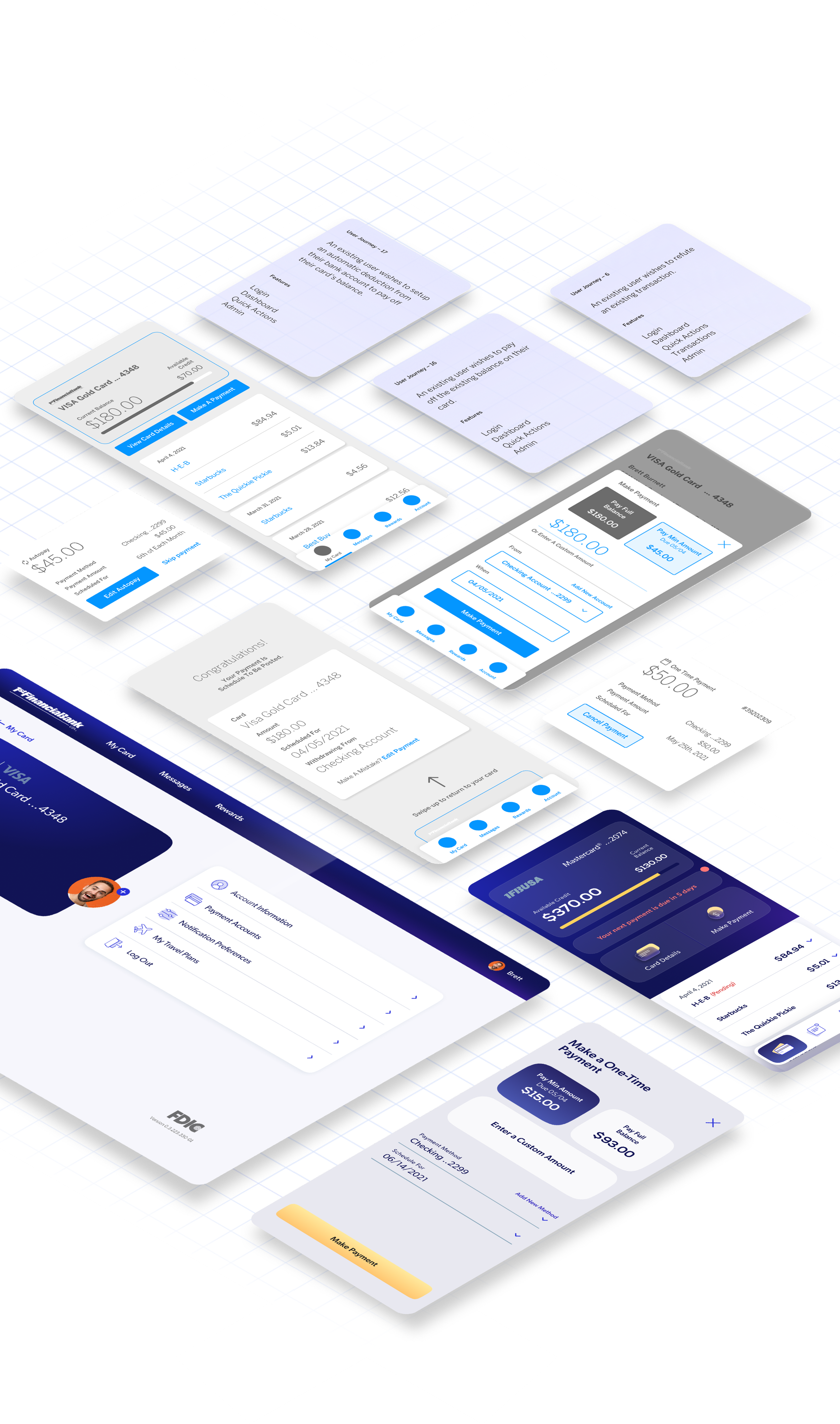
BHW developed an extensive library of user journeys that took into account every possible edge case while keeping in mind the main user flow set: Manage Accounts, Pay Balances, and Set up Autopayments. 1st Financial Bank USA works hard for its customers and needed a robust, feature-packed, responsive application that works just as hard.
From building UX flows to building credit
1FB’s classic blue floods through the new design ecosystem
With the user base being college students, aged 18-25, the app needed to be optimistic and modern, and at the same time professional and trustworthy. We used the bank’s current brand colors and styling to inform the newly appointed UI moving forward so that the entire brand ecosystem felt like an extension rather than a departure.
Built to Scale
We began with a mobile-first approach that informed the design of the mobile web and desktop versions, ensuring continuity and a seamless experience across devices. This approach allowed us to create a solid foundation that can be easily expanded and improved in the future.
Home Screen
The home screen of a banking app plays a pivotal role in the user's experience. Thus, we made a concerted effort to design an intuitive user interface that simplifies and organizes the app's content into easily scannable modular sections. This design ensures that users can quickly access the information they need and enhances the overall user experience.
Upon login, the user is immediately presented with statements and balances, and other crucial information pertinent to their account. The dynamic notification bar gives you actionable CTAs when you have account alerts or upcoming due dates. Below that you can navigate to card details, or make a payment.
Transactions
As you scroll down the page you can sort through recent transactions, and tap into the details of a specific transaction by expanding or collapsing the component.
With this accordion concept, we give users full control over their finances by allowing them to view the merchant details, transaction data, and report fraud. This also creates a frictionless experience that does not interrupt the user’s journey with superfluous pages and modals.
Payments
From the home screen, the user can navigate to the payment modal, where they can select whether they want to pay the minimum, full balance, or enter a custom amount.
Autopay
Users are able to fully customize, edit, and remove multiple automatic payments with ease. While picking your payment date, the app highlights due dates and makes it easier for the user to automate and stay on top of their payment schedules.


