Kit and Ace
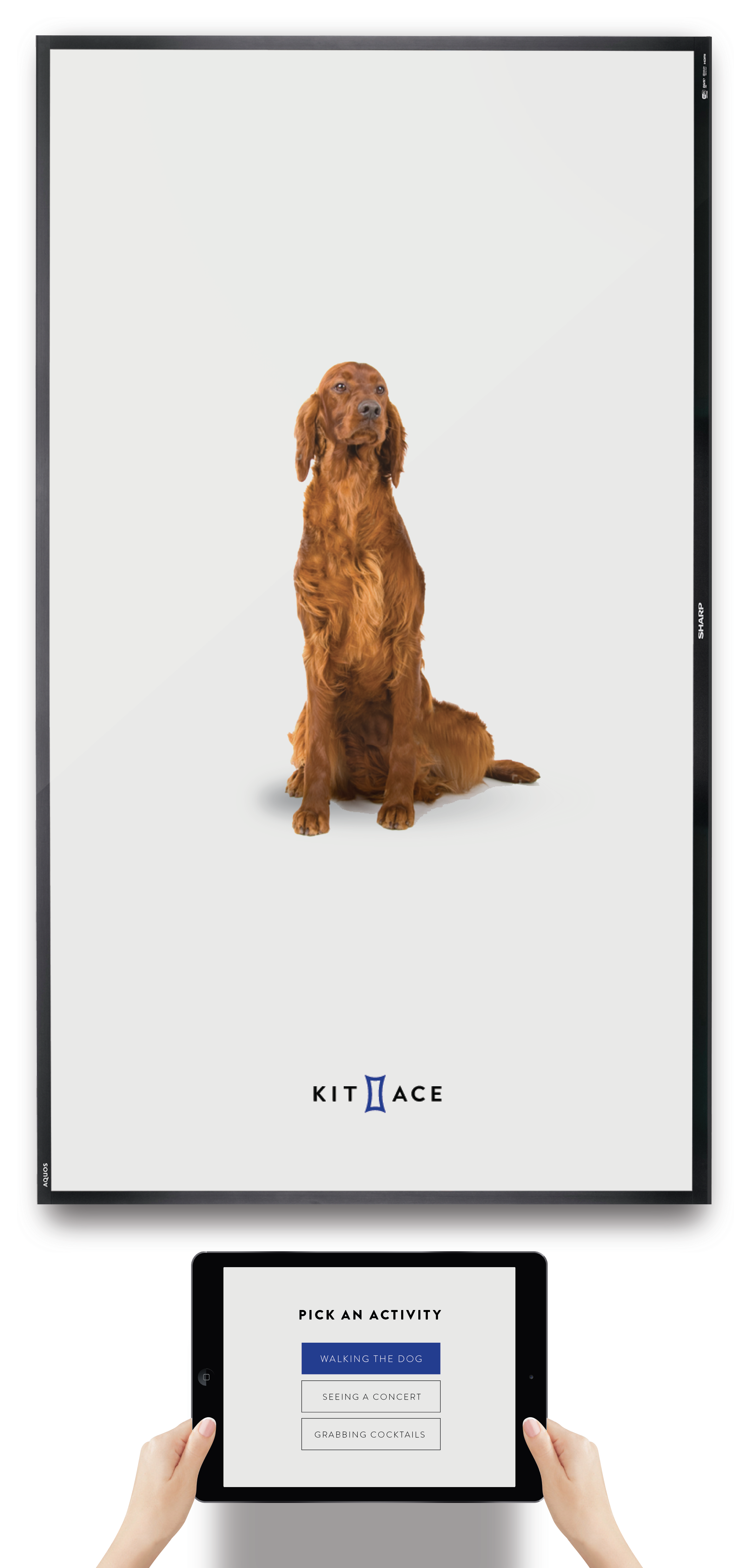
For clothing brand Kit and Ace, the challenge is to create functional clothing that transitions from day to night. The challenge for the team at Tuple was to communicate to customers how we can connect consumers to the brand and their products through a beautiful, intuitive demonstration. I worked with the research and design team at Tuple to put together information architecture, a user flow, and executed compelling design and UX to pull shoppers into the beautifully styled world of Kit and Ace, where they can explore the catalog, find products that fit their tastes, and add the product to their bag. I took visual cues from Kit and Ace’s website, social media marketing and clothing to incorporate their aesthetic into the experience.
Services Provided
Customer Journey Mapping
Information Architecture
UI/UX
Art Direction
Animation
Years
2016
These are our situational icons to display when the user is prompted to pick an activity on the iPad.
I wanted the imagery to be playful and tactile.
After the user selects an activity, the screen combines the activity with the location imagery.
We decided to keep it local and Austin-centric.
After the user confirms their choices, they are presented with 3 personalized looks. The user then taps on their favorite look to complete the solution sell, and is prompted to add the product to their bag, request different sizes, and pair accessories.


