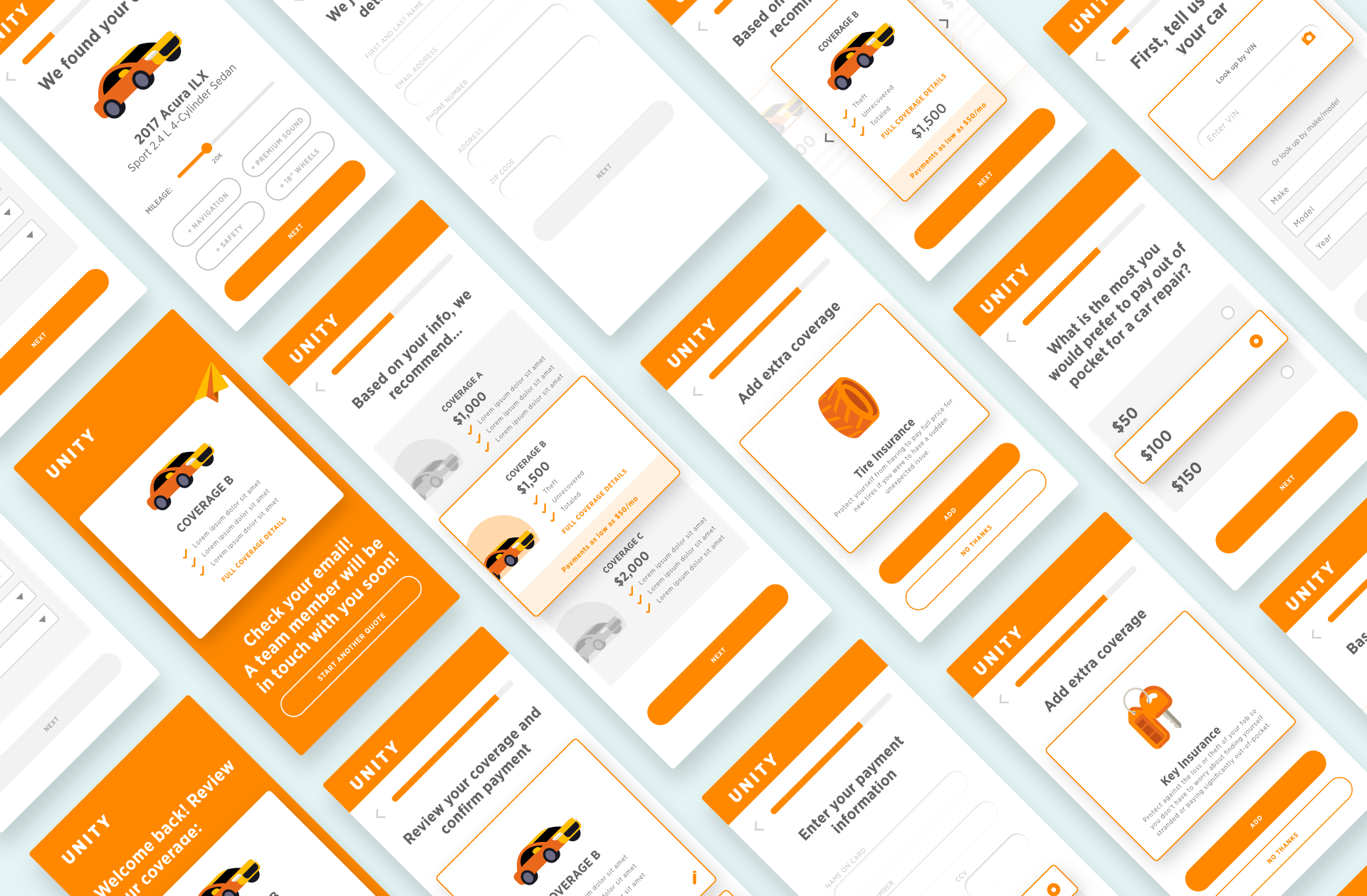
The Challenge
How do we educate, persuade and drive customers to purchase gap insurance while on their financial institution's website? I was asked to lead the design for a modern, easy-to-use, responsive web app that could grab the customer's attention and walk them through the process in an easy-to-digest format. My duties included naming, research, information architecture, interface design, prototyping, and iterative user testing.
Services Provided
User Journey
Wireframes
Design & UX
Prototyping
Year
2018
Information Architecture
In keeping the flow linear, and keep it to one question per screen, we are able to break up the data collection process into smaller chunks so that the whole process doesn’t feel overwhelming. Each page will contain one actionable item, and we allow ample opportunity to edit, review and review again to give the user full confidence in their decision.
Even if the user does not feel comfortable purchasing on the spot, we allow email capture and the user can get a quote sent to them so that we can relieve any pressure for the sale.
Wireframes

90% of users thought the first screen was compelling and had a clear call-to-action.
The users tested very positively to the first screen, and they were educated before we started the user test that this application would most likely live in a website, surrounded by content.
Key takeaways from user testing
〰️
Key takeaways from user testing 〰️
90% of users understood intuitively that we have preselected the best deductible for them, and that they can adjust the deductible to their preference.
100% of users in this test understood intuitively that we were suggesting the option flagged best for them through the backend, and that they are free to navigate through options to further customize their experience.
Out of the 20 users we surveyed, 80% of users were likely to purchase key insurance after being educated about the advantages.
The confirmation page did a successful job in making users feel like they had made the right decision, they were protected, and made the right investment in their car.
100% of users were clear that they were receiving a confirmation email with further steps.

Research and iterative user testing paid off for Unity with excellent performancewith customers throughout the bank’s loan flows. The app was later acquired by other clients to be a white-labeled product and used throughout other financial institution’s loan process.


